

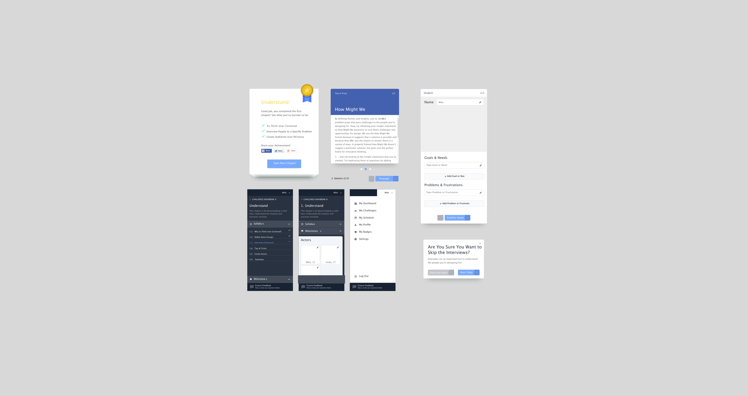
A simpler way for two generations to learn together
Research and experience design for a one-to-one learning platform connecting senior learners with young teachers.
Got It · Online learning · 2013–2014 · UX research, information architecture and interaction design
The experience challenge
The product had to make a broad set of learning tools feel simple to two groups with different levels of digital confidence. I worked with the product owner to understand their needs, map the learning journey and test a clearer structure.
What I did
User and competitor research · Interviews with seniors and young teachers · Card sorting and tree testing · Information architecture · Clickable prototypes and usability testing
Start with the people, then shape the structure
The research focused on motivation, digital confidence, access to technology and the relationship between learners and teachers. Those findings informed the sitemap and content hierarchy, which I evaluated through card sorting and tree tests.
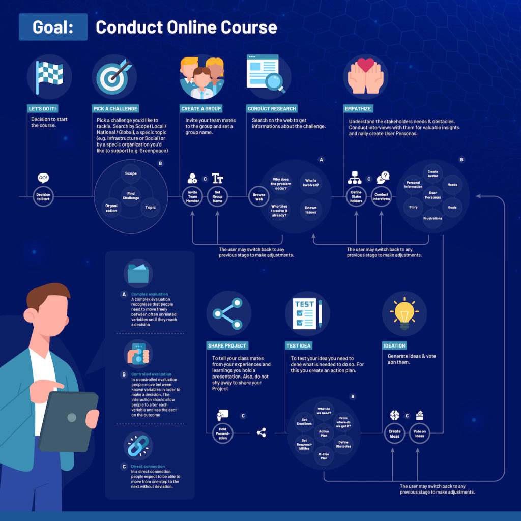
User task models
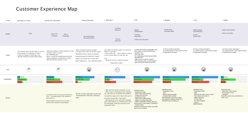
Customer experience map
Test the information architecture
After the content audit and competitor review, I defined the sitemap and tested whether people could find the right information. Paper sketches and interactive prototypes helped surface issues in navigation, wording and interactions before the next design iteration.
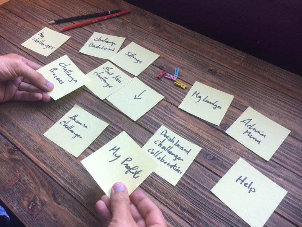
Card sorting with participants
Designing a learning experience for diverse users?
Let’s make the journey clearer through research, structure and testing.